Transform complex project data into clear, decision-focused dashboards and reports that give leadership full visibility at a glance.
Overview
Dashboards and visualization convert complex project data into clear, interactive visual reports — making it easy for management and stakeholders to understand project health, track KPIs and make confident decisions quickly.
We build tailored dashboards using Power BI, Tableau and Excel that display schedule performance, cost tracking, earned value metrics and resource utilisation — all in one place.
Our Deliverables
A full suite of visual reporting outputs tailored to your project, client and industry requirements.
High-level management dashboards showing overall project health — schedule status, cost performance, milestone tracking and key risk flags — in a single view.
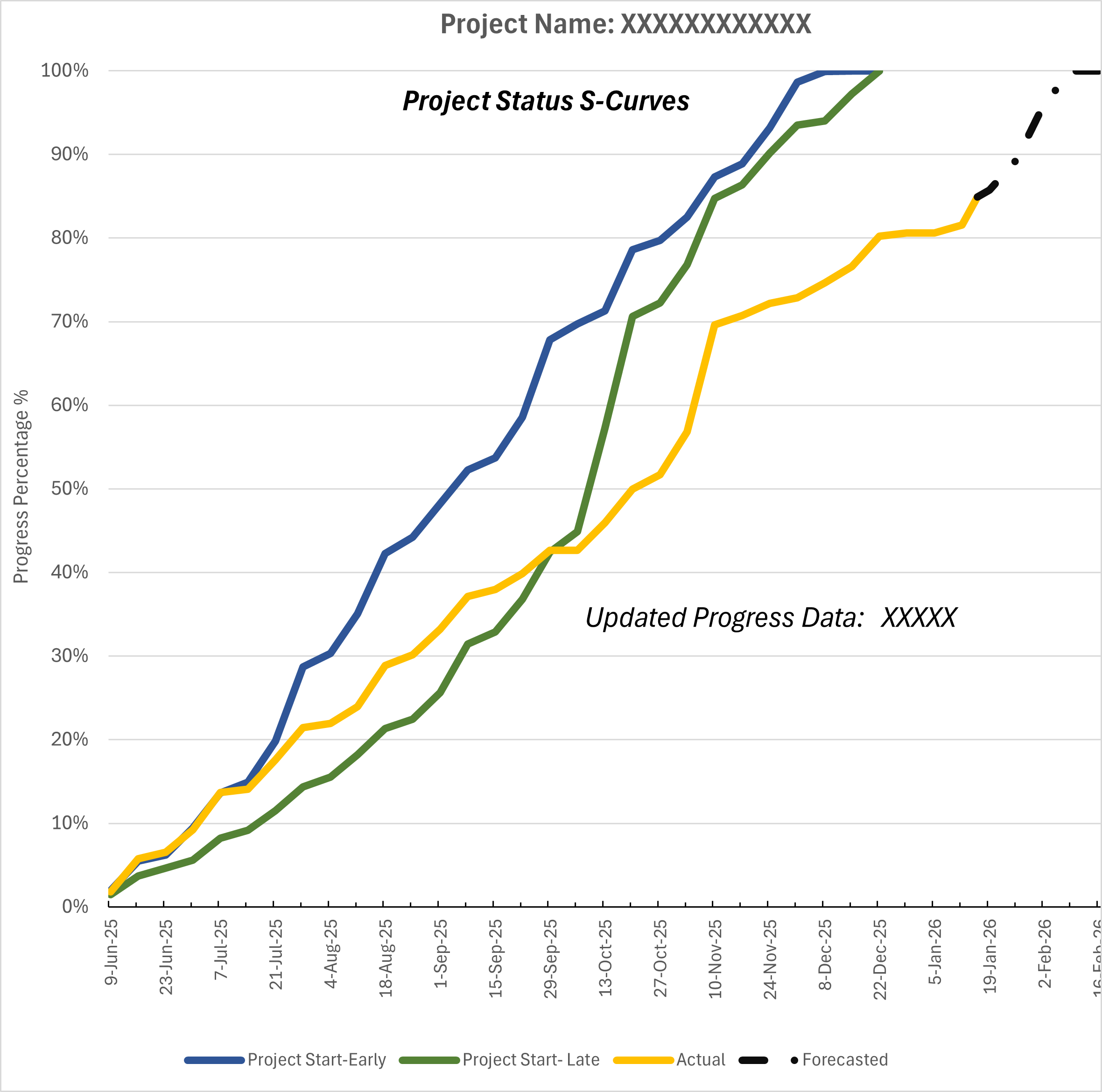
Planned vs actual S-curves showing cumulative progress, cost and earned value over time — enabling instant identification of schedule and cost variances.
Period-by-period cost histograms showing budget, actual spend and forecast — essential for cash flow management and financial reporting.
Resource usage histograms from Primavera P6 showing workforce demand by period — enabling proactive labour planning and cost control.
Structured progress reports with narrative, KPI tables, S-curves and lookahead information — ready for submission to clients and management.
Custom-built KPI dashboards tailored to your organisation — tracking the metrics that matter most to your project governance framework.
Tech Stack
Industry-leading platforms that turn raw project data into clear, actionable intelligence.
Interactive dashboards connected to live project data — drill-down capability, automated refresh and shareable reports for any device.
Advanced data visualization for complex multi-source datasets — ideal for large infrastructure and EPC project reporting environments.
Custom-built Excel dashboards, S-curve templates, EVM trackers and histogram tools — fast to deploy and compatible with any client system.
Key Concept
An S-Curve is one of the most powerful tools in project management — it shows cumulative project progress, cost or manhours plotted against time, forming a characteristic "S" shape as work starts slowly, accelerates mid-project, then tapers near completion.
By overlaying planned and actual lines, the S-curve instantly reveals whether a project is ahead or behind — making it a critical communication tool for clients, management and project teams alike.
S-Curve — Planned vs Actual Progress
Let us build you a dashboard that gives your team and your clients real visibility into project performance.